Live

CompareCitySizes.com

See how cities really compare, on one map at true scale

Put two cities on the same map, drag one over the other, and see the difference at once. Comparison pages add population and density; a link reopens the same cities for anyone you send it to. Free, in the browser — up to ten cities with an account.

Built for
Educators and students, Curious searchers, Ranking readers, Journalists and explainers
Live at
comparecitysizes.com
What was done
  • Product design
  • Web app
  • Interactive map
  • Programmatic SEO
  • Geospatial data
  • Data visualization
  • Auth & sign-in
  • Sharing
  • Structured data
  • Content & rankings
  • Analytics
  • Deploy
Watch: a 30-second tour of the main features.

Built with

Front end
  • React
  • Vite
  • Zustand
  • Ant Design
Map & geodata
  • Mapbox GL JS
  • Mapbox GL Draw
  • GeoJSON
  • OpenStreetMap via Nominatim
Back end
  • Node.js
  • Express
  • PostgreSQL
  • Google Cloud Run
Mail & hosting
  • AWS SES
  • S3
  • SNS
  • Lambda
  • CloudFront
Search & analytics
  • Schema.org structured data
  • XML sitemaps
  • Google Tag Manager
  • GA4
  • Search Console

The challenge

City statistics are easy to find but hard to feel. A population number or square-kilometer figure does not tell you how large a place feels relative to another, especially across countries and continents.

  • Wikipedia and spreadsheets list facts in rows, not on a map you can reason about.
  • Screenshots of maps use inconsistent scales, so comparisons mislead readers.
  • A number says nothing about shape: two cities of equal area can look nothing alike on the ground.

The approach

CompareCitySizes renders cities as true-scale overlays on one map. You pick two, drag one over the other, and see the difference at once; the comparison pages add population and density beside the area. A link reopens the same cities for anyone you send it to.

  • One shared scale for every city in the comparison
  • Area on the map; population and density on the comparison pages
  • Links you can paste into stories, decks, or lesson plans
  • No account required to explore and share

Four steps, no manual

  1. Search for a city

    Type a name, pick the right place from the suggestions. The map centres on it.

  2. Add comparison cities

    The next city lands on the first, at the same scale. Drag either one to line them up.

  3. Read the stats panel

    Each city’s area sits in the sidebar; the overlap tells the rest. Rotate a shape if it helps.

  4. Share the link

    Copy the link into an article, a lesson or a chat. Whoever opens it gets the same cities.

What it looks like

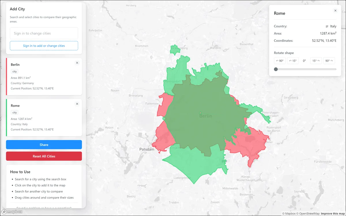
CompareCitySizes.com: Rome laid over Berlin at the same scale — 1,287 km² against 891 km², with the rotate control open.
Rome laid over Berlin at the same scale — 1,287 km² against 891 km², with the rotate control open.
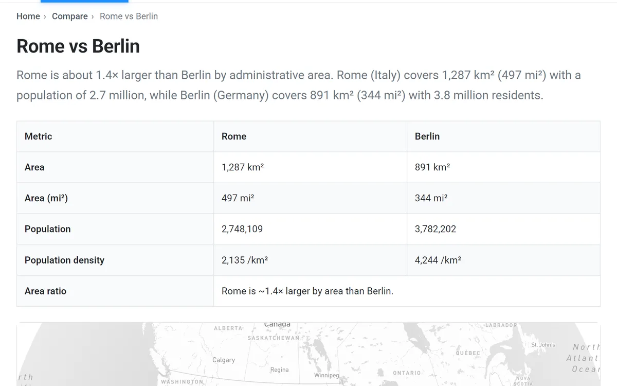
CompareCitySizes.com: Area, population and density side by side on a comparison page — here Rome against Berlin.
Area, population and density side by side on a comparison page — here Rome against Berlin.
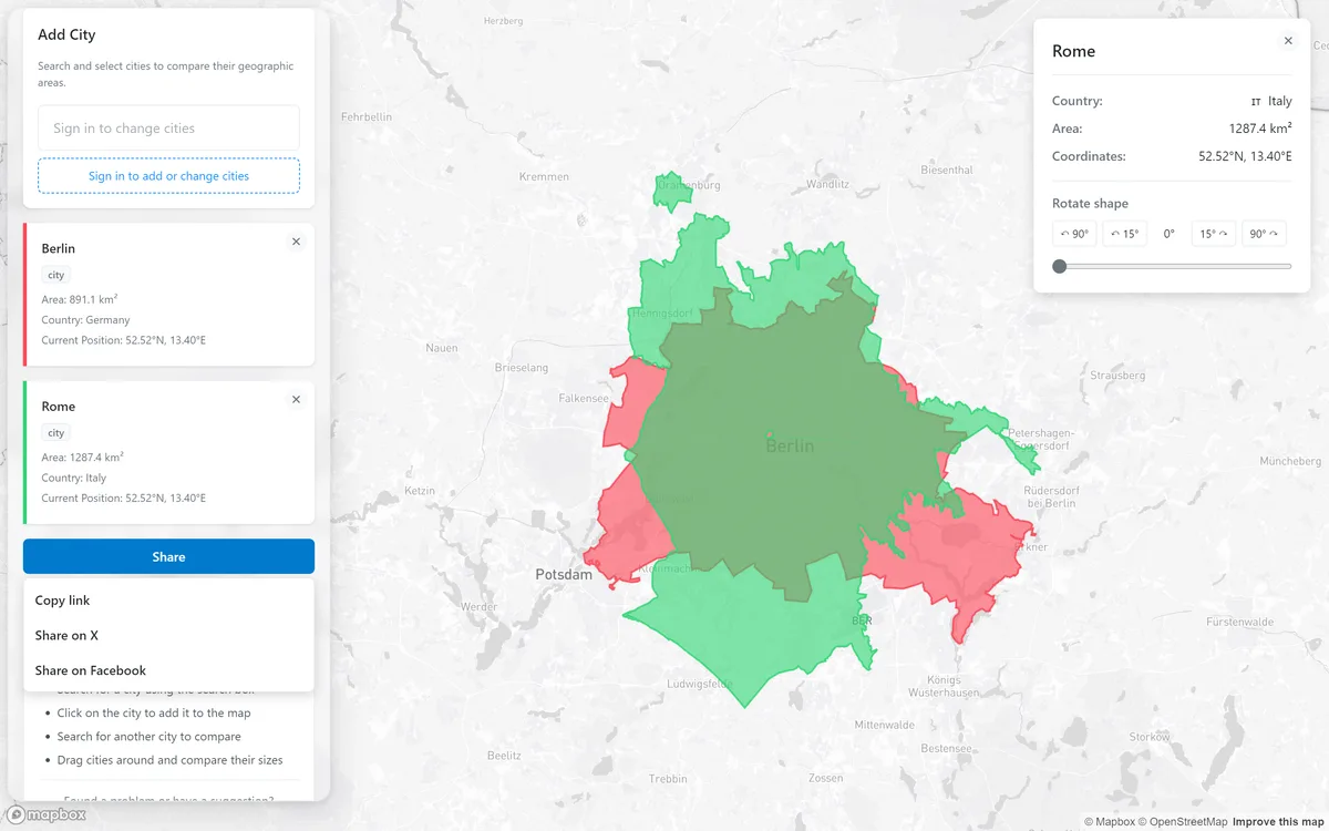
CompareCitySizes.com: Share copies a link that reopens the same cities for whoever follows it.
Share copies a link that reopens the same cities for whoever follows it.

What it does

  • True-scale overlays

    Cities render at geographic scale on the same basemap, so “bigger on screen” means bigger in reality, not a cropped screenshot at different zoom levels.

  • Rotate a city to fit

    Turn a shape in 15° steps or with a slider so it sits along a coastline or a river the way the city you are comparing it with does — a fairer read of the overlap.

  • Up to ten cities at once

    Two without an account, ten with one — capitals, metro regions or peer cities on a single canvas.

  • Shareable links

    Share copies a link that reopens the same cities for whoever follows it — in an article, a lesson or a group chat.

  • Comparison pages with the numbers

    Every pairing has its own page with area, population and density side by side — the table for when the shape is not enough.

  • Nothing to install

    Runs in any browser, phone included. No GIS licence, no download, no sign-up to start.

Who uses it, and for what

  • Curious people, mid-argument

    Settling “which is bigger?”

    Most visitors arrive from a search for exactly this — “city size comparison” — put New York, Tokyo or London on the map and start dragging. Dragging is the product: 260,000 drags by 13,000 people in one summer, about twenty each.

  • Teachers and students

    Classroom geography

    Educators find it on their own: a public education portal sent a class-sized burst of visits over three days, and lesson platforms and Teams links keep showing up in the referrers. Two cities, one map, no account — it works on the projector and on the students’ phones.

  • Anyone who wants the number

    Rankings as answer pages

    The GDP, population, density and largest-cities pages answer the question on the page — over a thousand visits a month come for the table, not the map. A quarter of the largest-cities readers go on to the map.

  • Journalists and explainer writers

    For stories that need scale

    Not yet where most visitors come from, but what the tool was built for: a true-scale overlay makes a point a table cannot, and a shared link reopens the same cities inside the story.

Built to be found

People search for exactly what the site is: “city size comparison” is the top query, and the map ranks in the top three for it. The ranking pages for GDP, population and largest cities bring their own search traffic. Search clicks grew five-fold in a year, from about 2,200 a month to 11,000.

Underneath, every city pairing has its own page — title, description, canonical URL, structured data — 373 of them. They already rank in positions three to six; pair-by-pair demand is still small, so they are an investment ahead of the query.

98.2K
clicks from Google Search since July 2025, from a standing start
1.3M
search impressions since July 2025
81%
of visits arrive from organic search; the rest is mostly direct
11K
visits a month on average, March to August 2026, from more than 160 countries
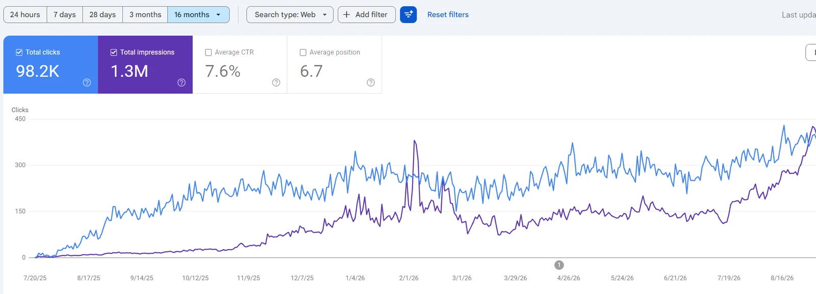
Google Search Console for comparecitysizes.com since July 2025: 98.2K total clicks, 1.3M impressions, 7.6% average CTR, average position 6.7, with clicks climbing from zero in July 2025 to around 400 a day.
Google Search Console: clicks (blue) and impressions (purple) since July 2025.

The panel behind the product

Running a product is most of the work of having one. So alongside the map we built the panel it needs: a support inbox that grew into a mail client, an editor for the city shapes, and the cache that keeps lookups fast.

Feedback & support

Every user message in one place — without a helpdesk subscription

Bug reports find what tests miss; feature requests say what to build next. Rather than bolt on a helpdesk, support lives in the product’s own admin panel.

  1. User

    Fills in the contact form (General Feedback · Bug Report · Feature Request) — or simply emails support@comparecitysizes.com.

  2. System

    Every message becomes a ticket, categorized and stored with its full email history. Direct emails are received by AWS and threaded automatically, even when the user replies from their phone.

  3. Owner

    Opens the admin Feedback tab, filters by open / bug / feature, reads the whole conversation, and replies from the panel. The reply goes out from support@ and stays on the ticket.

  4. Result

    No shared Gmail password, no Zendesk seat, no messages lost in a personal inbox. One source of truth, run from a browser.
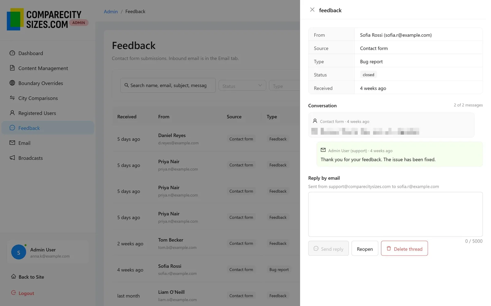
The admin Feedback tab: a list of contact-form tickets with type and status, and an open bug-report thread in a side panel with the owner’s reply and a reply box sending from support@comparecitysizes.com.
The admin Feedback inbox: a threaded bug-report conversation.
  • Typed feedback, not a free-text blob

    Bug, feature and feedback categories each ask the user for the right details up front — reproduction steps for bugs, the ‘why’ for feature requests.

  • Real email threading

    Standard Message-ID / In-Reply-To headers plus a plus-address fallback (support+ticket@) keep replies attached to the right ticket regardless of the user’s mail client.

  • Grew into a full mail client

    The same pipeline now handles every @comparecitysizes.com address in a Gmail-style Email tab: auto-detected mailboxes, threaded reading pane, compose from any domain address, templates, and sending to registered users.
Shape editor

When a boundary is wrong, fix it on the map

Every comparison rests on the outline the map draws, and the outlines come from OpenStreetMap — which sometimes hands back a region for a town, or an airport for a city.

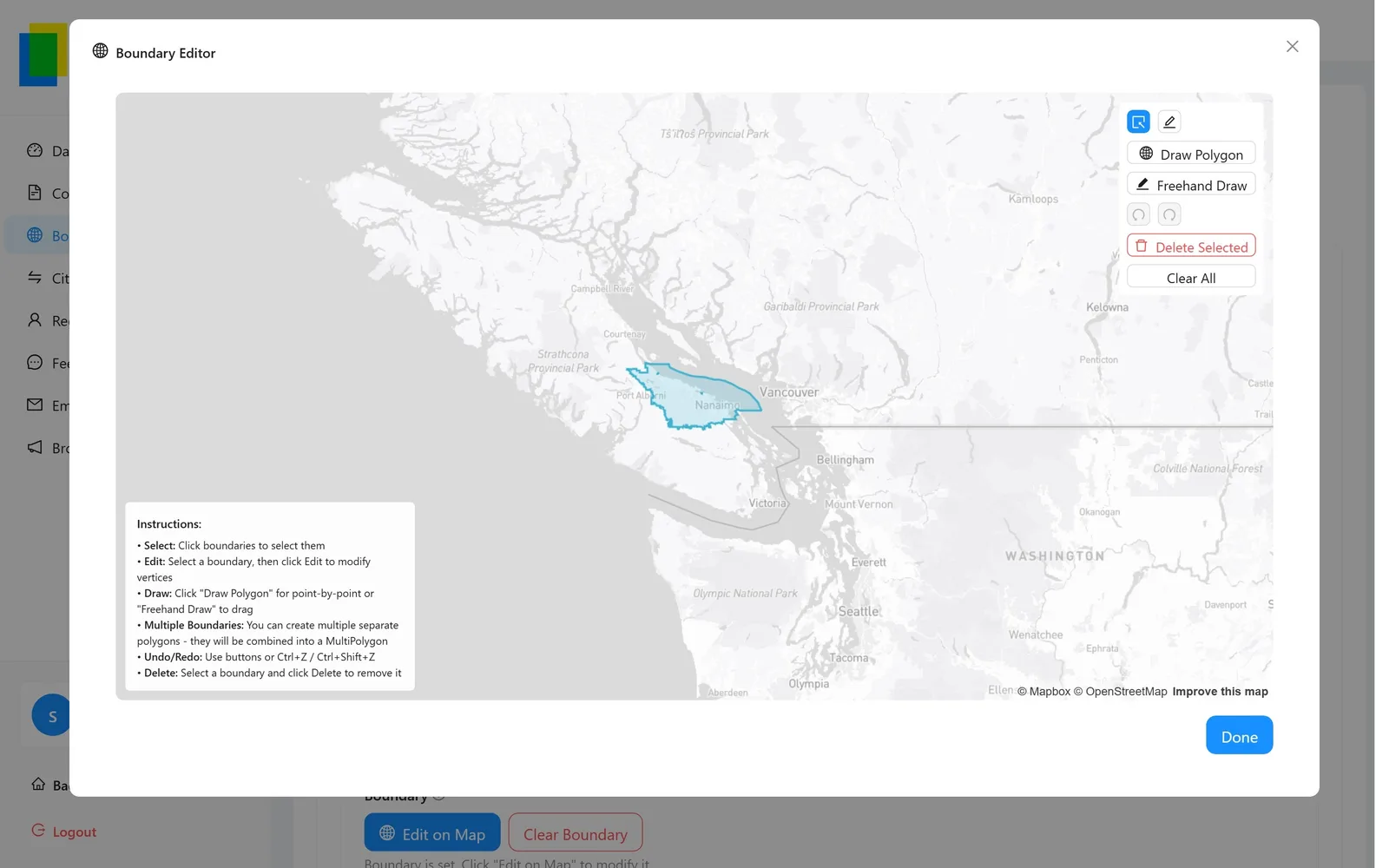
So any boundary can be opened in an editor on the map: draw a polygon point by point or freehand, drag its vertices, combine several into one shape, undo and redo, or paste GeoJSON. Save, and the corrected outline is what every visitor sees from then on.

The Boundary Editor: a city outline on a Mapbox map with Draw Polygon, Freehand Draw, undo/redo and delete tools, and instructions for editing vertices and combining polygons.
The Boundary Editor: a district outline open for editing, with draw, freehand, undo/redo and delete tools.
  • Draw or trace

    Point-by-point polygons for precision, freehand for speed; several polygons combine into a MultiPolygon for cities with islands or exclaves.

  • Overrides beat the source

    An edited boundary is stored as an override, so a later refresh from OpenStreetMap never quietly puts the wrong shape back.

  • Closes the loop with support

    A “wrong outline” bug report is fixed in the same panel it arrived in — open the ticket, open the city, redraw, reply.

  • Metadata alongside

    Area, population, coordinates and a note travel with the shape, so the comparison page updates with it.

Caching

Fetch a boundary once, serve it forever

City outlines come from Nominatim, OpenStreetMap’s geocoder — slow, rate-limited, and not something to call every time someone types “Tokyo”. So every boundary is stored in the site’s own database on first use and served from there afterwards; repeat lookups never leave the server.

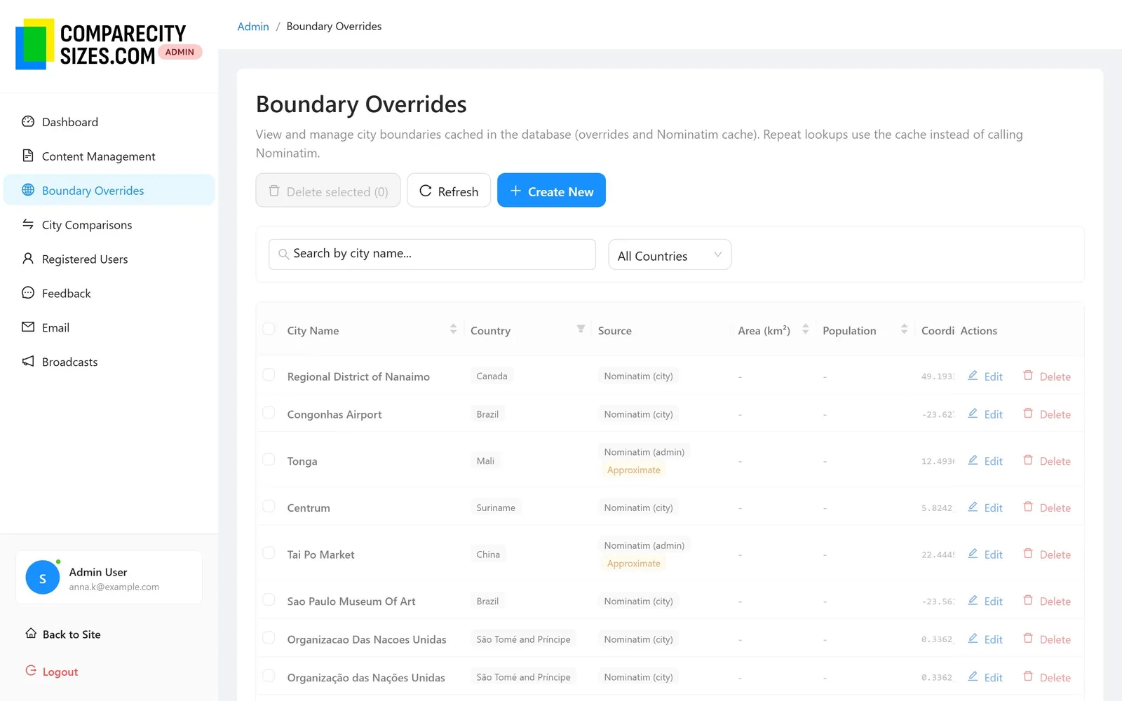
Today that cache holds 20,948 city boundaries, each with its source recorded. It is the same table the shape editor edits: an override is simply a cache entry a human has corrected.

The Boundary Overrides list: 20,948 cached city boundaries with their source (Nominatim city or admin, some marked Approximate), coordinates and last-updated date.
Boundary Overrides in the admin: 20,948 cached boundaries, with the source of each — Nominatim city or admin area, some marked approximate.

Common questions

How accurate are the city boundaries?

Outlines are administrative boundaries as mapped in OpenStreetMap, and a few are flagged approximate in the app. They are right for comparison and teaching, not for legal, survey, planning or statistical use.

Can I compare more than two cities?

Yes — up to ten on one map once you sign in with Google, Facebook or email. The shared link reopens the whole set.

Do I need an account?

No. Comparing two cities and sharing the link works without one; an account lifts the limit to ten.

Try CompareCitySizes.com

Open the product, or talk to us about building something similar for your team.